
WHAT IS WEB DESIGN?:
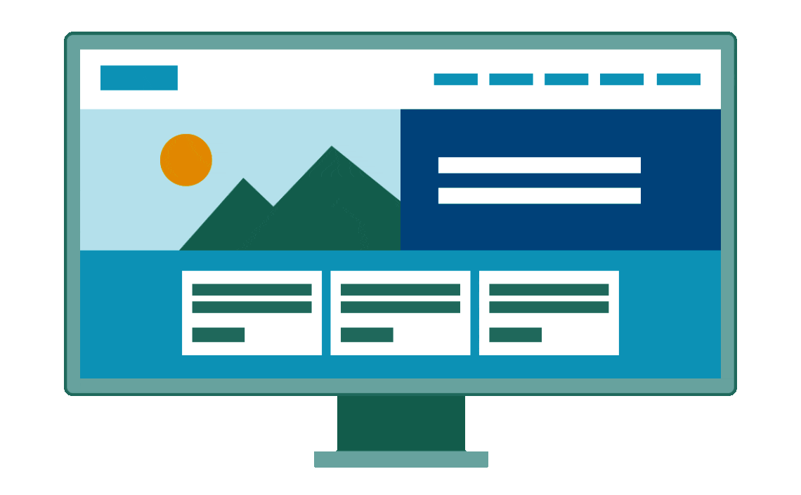
Web design is the process of creating websites. It involves a combination of web page layout, content production, and graphic design. Web designers use HTML, CSS, JavaScript and other coding languages to create visually appealing web pages that users can interact with and navigate through. Web designers also create usability features that make websites easier to use, and they often work closely with web developers who specialize in writing code for the back-end of the website.
CHOOSING A WEB DESIGN TOOL:
There are two main ways to design a website: using a desktop app or using a website builder. The tool you decide to use will vary greatly based on your team size, your budget, and the type of site you wish to build and its technical requirements.
Desktop apps require designers to create their design and send it to a development team who can then convert the design to code. The most popular desktop apps for designing websites are Photoshop and Sketch.
Typically, this is the standard for large and/or complex websites because it allows the designer to focus on the overall look and feel, while all the technical challenges are transferred to the development team. Unfortunately, this process can be expensive and time-consuming because multiple resources, skill sets, and team members are required.
To avoid involving a developer, it is beneficial to use a website builder to design a website with fewer technical requirements.
There are many website builders on the market today that offer a wide range of features and services. Wordpress, Wix, Squarespace are just a few examples of popular website builders that vary in design capabilities, template options, price, and overall editing experience. Be sure to do your research, experiment with free trials, and determine which platform best fits your website needs.
Website builders create either adaptive or responsive websites, which offer different building experiences. These concepts will be discussed in more detail so you can best understand which builders will work for you. If you don’t know how to code, becoming familiar with the freedoms and limitations of various website design tools is essential. For example, although WordPress is the most used website platform, it’s not popular with visual designers because of its limited customization options.
Before you start building a website, determine your website needs: Are you creating a photo gallery? How often will you update your site? Do you need a contact form? Choose a website builder that can help you effectively accomplish those goals.

Understanding the pros and cons of adaptive and responsive websites will help you determine which website builder will work best for your website design needs.
You might come across articles online that talk about a whole bunch of different website design styles (fixed, static, fluid, etc.). However, in today’s mobile-centric world, there are only two website styles to use to properly design a website: adaptive and responsive.
ADAPTIVE WEBSITES:
Adaptive web design uses two or more versions of a website that are customized for specific screen sizes. Adaptive websites can be split into two main categories based upon how the site detects what size needs to be displayed:
When your browser connects to a website, the HTTP request will include a field called “user-agent” that will inform the server about the type of device attempting to view the page. The adaptive website will know what version of the site to display based on what device is trying to reach it (i.e. desktop, mobile, tablet). Issues will arise if you shrink the browser window on a desktop because the page will continue to display the “desktop version” rather than shrinking to the new size.
Instead of using the “user-agent”, the website uses media queries (a CSS feature that enables a webpage to adapt to different screen sizes) and breakpoints (certain width sizes) to switch between versions. So instead of having a desktop, tablet, and mobile version, you will have 1080px, 768px, and 480px width versions. This offers more flexibility when designing, and a better viewing experience as your website will adapt based on screen width.
WYSIWYG editing (what you see is what you get)
Custom designs are faster and easier to build without code
Cross-browser and cross-device compatibility
Fast-loading pages
Websites that use “device-type” can look broken when viewed in a smaller browser window on a desktop
Limitations on certain effects that only responsive sites can accomplish
Fast-loading pages
Responsive websites can use flexible grid layouts that are based on the percentage each element takes up in its container: if one element (e.g. a header) is 25% of its container, that element will stay at 25% no matter the change in screen size. Responsive websites can also use breakpoints to create a custom look at every screen size, But unlike adaptive sites that adapt only when they hit a breakpoint, responsive websites are constantly changing according to the screen size.
Great experience at every screen size, regardless of the device type
Responsive website builders are typically rigid which makes the design hard to “break”
Tons of available templates to start from
Requires extensive design and testing to ensure quality (when starting from scratch)
Without accessing the code, custom designs can be challenging
Copyright 2020 - 2023. All Rights Reserved | Powered by BiTS